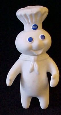
I'd suggest doing something different with the text. No sense in putting half of your name under someone's bindings and boots. Try fitting it under the mountains or on the tail and see how it looks.
Yeah, I know what you mean. I just figured that the important bart was "doughboy" and the snowboards didn't really need to be seen. I wanted to make sure the doughboy was big enough to stay visible. Thanks for the input, I am going to mess around with it some more and see if there's a better layout.
I am definitely going with that last one. That will be the "classic". I also am going to offer the "reaper" which is based on a piece by Katie Alfonsi www.artwanted.com/fonzy
What will you be using for the graphic material? Cotton cloth?, Rice paper? and a clear topsheet too? Looking forward to seeing the finished product. Post the some pics when you get one made.